
Colour Theory and Interior Design for Your Doll’s House
by Janet Granger
In November 2024 I retired, so this page is now a ‘legacy archive’ only. I NO LONGER SELL THESE KITS, so please do not contact me asking where you can buy them! I plan to keep this page up until at least the end of 2026, so that people can still see these inspirational ideas.
The colours that you choose to use in your doll’s house interior will make a huge difference to the success of your project. Not only do you have to get the colours right so that they ‘work’ with each other, but most miniaturists agree that the colours need to be correct for the particular historical period in which their doll’s house is set. Using colour theory, and a little knowledge about the colours which were prevalent in each historical period, can make an average room setting into a wonderful one!
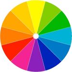 Colour Theory is based on the idea of the colour wheel. The colour wheel shown is a circle divided up into twelve sections. The three PRIMARY hues of red, yellow and blue occur at equal intervals around the edge, forming an equilateral triangle within the circle. The three SECONDARY hues of orange, violet and green are located between each primary hue and form another triangle. Red-orange, yellow-orange, yellow-green, blue-green, blue-violet, and red-violet are the six TERTIARY hues. They are made by mixing a primary hue with a secondary hue.
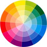
When a primary, secondary or tertiary hue is said to be at a level of ‘full saturation’ (brightness) it means that there is no black, white or grey added. White added in increments to any of the twelve hues results in lighter values of the hue called TINTS. For example, pink is a tint of the primary colour red. Black or grey added in increments to a hue results in darker values of the hue, known as SHADES. For instance, a shade of red is maroon.
At different periods in history, the fashions have tended to favour different areas of the colour wheel – and once you become familiar with these, it will be easy to choose colours for your doll’s house interiors.
Tudor design style developed in England during the late 1400’s and remained through to the early 1600’s. The natural materials used for exterior Tudor architecture – oak, stone, plaster, brick, iron and slate had a large influence on interior design for Tudor homes, so there is a prevalence of earthy shades (brown, copper, tan, with beige and stone tints for the floor treatments). Walls were most commonly covered in rich oak panelling (at least in wealthier homes). Fashions in interior design focussed on elements from church architecture and references to family history such as crests, coat-of-arms, and stained glass. Vibrant colours were common, such as jewel shades in rusty reds, royal blues, deep purples and forest greens. Using these colours in rich fabrics like velvet, brocade, and damask for things such as curtains and bed covers gives a comfortably elegant feeling. So that your interiors do not get too gloomy, do what the people of the time did, and lighten things a bit with highlights to off-set the deep palette with brighter yellows and gold within the fabrics and accents of the room.
Towards the end of the Tudor period, wealthy home owners began to paint their walls and woodwork with oil-based paint, mixed with red or white lead and linseed oil. Most affluent homes had wood paneling from floor to ceiling, which were then painted cream or a mid-tone brown. Sometimes the wood work, including doors, baseboards, and shutters, were painted in darker browns or even black. This was the norm until the middle of the 18th century, when everything changed dramatically.
Around 1760, interiors started becoming lighter and lighter thanks to the use of plaster. Wainscoting and wood panels were replaced by plaster walls above the chair rail. To protect this plaster surface, dado rails became all the rage. Today, we think of plaster as being bright white, but back in the Georgian period, plaster was a softer white with a yellow undertone due to the linseed oil and lead mixture. While basically anyone could tint their plaster with earth tones like yellow or brown, only the wealthy could afford the more decadent, costly colours. Tints such as blossom pink, straw, pale orange and lemon became popular, as well as cool ones like olive and light blue. Deep greens and cobalt blues were the most expensive pigments to obtain, and were limited to the very wealthy. This is because the pigments were created from natural flowers and roots.
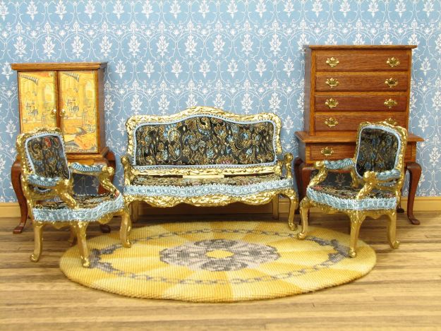
Georgian golds predominate in this photo
By the late Georgian period, really strong colours were being used below the chair rail, all but eliminating bare wood panelling. From terracotta to crimson, red dining rooms and libraries were all the rage, as people found it provided a striking backdrop to gold-framed artwork. But the big star of the Georgian period was green, in all shades and tints. Other popular late Georgian colours included Wedgwood blue (often with white or lemon for a restrained, classical look), soft grey, dusky pink and a flat white or stone.
Deep colours such as Hunter green typify the Victotian era
In spite of technological advances in the manufacture of chemical dyes during the second half of the 19th century, the use of paint colours throughout the Victorian period remained surprisingly close to the late Georgian period at first, though. By the 1840s the use of restrained, secondary tints such as buff, lilac and salmon was common, though paler tints of those and other strong colours were also used; Victorian interiors were by no means always the dark and gloomy rooms we have come to expect.
It’s worth noting that lighter colours were avoided in town areas because of pollution. Dark greens and blues minimised the effect of pollution from coal dust, and staining from gas and oil lamps – so, bear this in mind if the imagined ‘location’ of your doll’s house is important to you!.
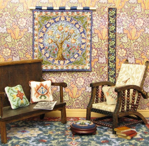
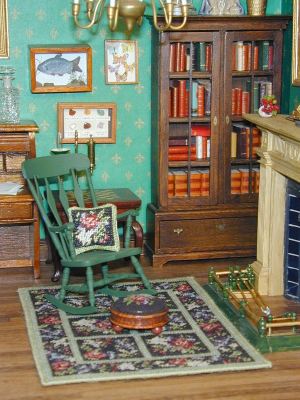
A William Morris room with the typical influence of the natural world
Towards the end of the Victorian period, other influences on interiors became popular. The Arts and Crafts Movement (beginning in the late 1870s), epitomised by William Morris, favoured botanically -inspired furnishings, so shades and tints of plant colours, especially greens and yellows, were often used. The Art Nouveau period (roughly 1880 – 1910) took similar inspiration from Nature, but was not averse to mass production to achieve its aims – but the colours used were often the same pale-ish tints of yellows, greens, pinks and peaches. It was sometimes described negatively as a ‘greenery-yallery’ style.
The Art Deco style of the 1920s and 1930s was quite diverse, and can be difficult to pigeonhole in terms of colour themes. The trend started by using mainly rich primaries and sophisticated punches of black (think Clarice Cliff pottery, for instance).
This subject is huge, and I’ve only been able to touch on the themes, here. Have a look for some good books on the subject, to see what is typical of each era in terms of colour and interior design.
Become familiar with the colour wheel, and the shades and tints that can be used to epitomise each era. Not only is it useful to find out what ‘should’ be the colour of your doll’s house room, but it’s great fun doing the research, too!
[This article first appeared in the June-July 2011 issue of the online Artisans In Miniature magazine. You can read it in scribd format here (pages 30-33).]